Multiple logistic regression is an important algorithm in machine learning. This post will show you how it works and how to implement it in Python.
This post follows on from linear regression explained.
Basics of multiple logistic regression
Multiple logistic regression is a classification algorithm that outputs the probability that an example falls into a certain category. The difference between logistic regression and multiple logistic regression is that more than one feature is being used to make the prediction when using multiple logistic regression.
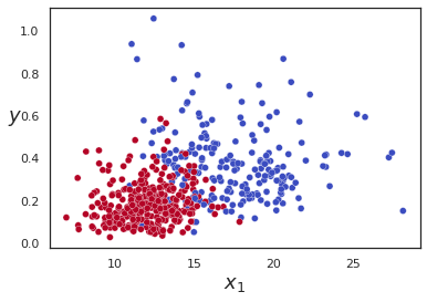
So, if we have a dataset with two features and two output categories, 0 or 1, such as that shown by the diagram below:
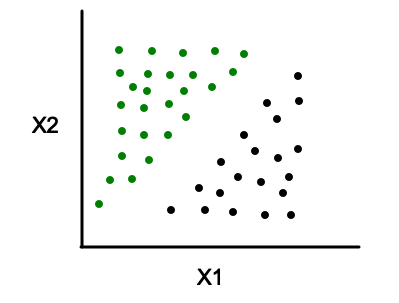
We’ll fit a curve and use it to make predictions.
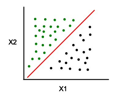
When to use multiple logisitic regression
Multiple logistic regression is used when there are two outcome categories and multiple independent feature variables. An example could be trying to predict if a student will pass or fail a class based on how many hours he/she studies a week and his/her current GPA.
How it works
With logistic regression for a single feature variable we had the following equation:
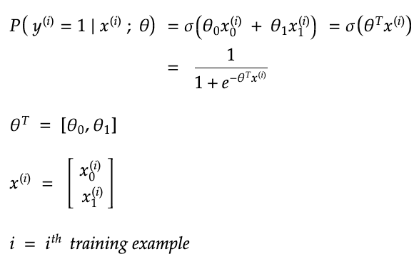
Instead, for multiple logistic regression, it will be necessary to modify the equation slightly to account for the extra feature variables as so:
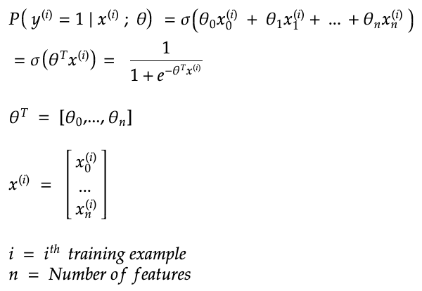
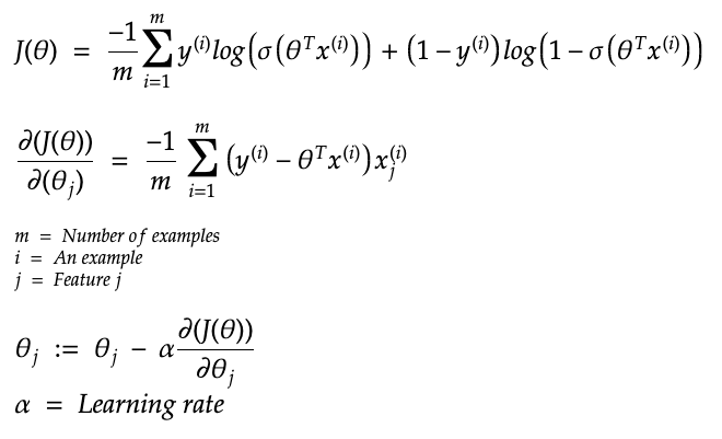
Now, we will use the same process to find the optimal values for the weights as we did with logistic regression for a single feature variable. So, we’ll use the log loss as the cost function and use its partial derivatives to update the weights as below:
How to deal with non-linear decision boundaries
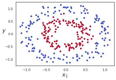
If you have a dataset with a non-linear decision boundary, it is still possible to use logistic regression. The way it works is practically the same as polynomial regression where you add polynomial terms.
So, you would modify the hypothesis equation to be as follows:

Code example
Below is an example of how to implement multiple logistic regression without non-linear features and example of how it is done with polynomial features.
import numpy as npimport matplotlib.pyplot as plt
import seaborn as sns
sns.set(style=”white”)
from sklearn import datasetsdata = datasets.load_breast_cancer()
Try it with just these two features so that we can see a decision boundary
plt.scatter(data.data[:,0], data.data[:,25], c=data.target.reshape(-1), cmap=”coolwarm”,edgecolor=”white”, linewidth=0.3)
plt.xlabel(“$x_1$”, fontsize=18)
plt.ylabel(“$y$”, rotation=0, fontsize=18)
plt.show()
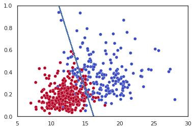
Now implement multiple log reg using just those two features and draw the decision boundary
X = data.data[:,[0,25]]
y = data.target.reshape(-1)
from sklearn.linear_model import LogisticRegression
clf = LogisticRegression().fit(X,y)
The code below shows the decision boundary of the model.
Credit for the plot https://stackoverflow.com/questions/41050906/how-to-plot-the-decision-boundary-of-logistic-regression-in-scikit-learn
line_bias = clf.intercept_
line_w = clf.coef_.T
points_y=[(line_w[0]*x+line_bias)/(-1*line_w[1]) for x in X]plt.plot(X, points_y)
plt.scatter(X[:,0], X[:,1],c=y,cmap=”coolwarm”, edgecolor=”white”, linewidth=0.3)
plt.axis([5, 30, 0, 1])
plt.show()
To make a prediction:
clf.predict(X)
Now let’s see how to create a multiple logistic regression model that contains polynomial features
from sklearn.datasets import make_circles
data = make_circles(n_samples=300, shuffle=True, noise=0.1, factor=0.5)
plt.scatter(data[0][:,0], data[0][:,1], c=data[1], cmap=”coolwarm”,edgecolor=”white”, linewidth=0.3)
plt.xlabel(“$x_1$”, fontsize=18)
plt.ylabel(“$y$”, rotation=0, fontsize=18)
plt.show()
from sklearn.preprocessing import PolynomialFeatures
poly_features = PolynomialFeatures(degree=2)
X_poly = poly_features.fit_transform(data[0])
clf2 = LogisticRegression().fit(X_poly,data[1])
The plot below shows the predictions. As you can see, it is getting the easy ones correct but not some of the points that are very close to the boundary between red and blue.
plt.scatter(data[0][:,0], data[0][:,1], c=clf2.predict(X_poly), cmap=”coolwarm”,edgecolor=”white”, linewidth=0.3)
plt.xlabel(“$x_1$”, fontsize=18)
plt.ylabel(“$y$”, rotation=0, fontsize=18)
plt.show()
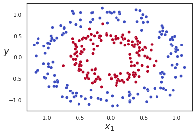
When making predictions, it is necessary to pass in X_polly and not X because the model was trained on X_polly, which has more features and not X.
Now get the confusion matrix to see how the model is doing.
from sklearn.metrics import confusion_matrix
confusion_matrix(data[1], clf2.predict(X_poly))
array([[147, 3],
[ 1, 149]])
This shows that it is getting some points wrong. If you compare the graph with the true answers versus the graph with the predictions, you’ll see that the errors are where the red and blue points are very close together. So, it shows that the model is doing pretty well overall.
